We are happy and proud to present you the new image of our company brand, Eurotab.
A whole new logo, new slogan, new colours, new website ... every single thing has been tweaked in order to stamp on a new momentum and commitment with regard to the future!!
NEW IMAGE
SO WHAT’S WITH THE RESTYLE?
Our previous slogan, "innovating together", was no longer a strong enough reflection of our choice to focus on 100% solidity.
Although it highlighted one of our strengths: innovation, it did not express the message we wanted our business to convey as a powder compactor. Our business is increasingly in tune with the expectations of consumers and our customers.
So it was time to bring our ideas closer together and to rethink our mission both in terms of content and graphic form.
The outcome is not a one-man job: it is the result of months of discussion and consultation with our teams and stakeholders. This open and collaborative way of working has enabled us to make a strong statement about our commitment to the preservation of the planet and the well-being of its people.
new image
nEW LOGO
Our new logo, with more streamlined and modern lettering, brings out our expertise in tablets by framing the word "TAB" in between two green brackets.
These green brackets, illustrating a movement of compaction towards the centre, symbolise the compression of powder, our expertise, and also our commitment to reducing our impact, not least on the environnement.
Using green, rather than the previous red colour, brings a sense of hope and nature, as nature is a valuable source of inspiration for example for more environmentally friendly formulas.

nEW IMAGE
new slogan
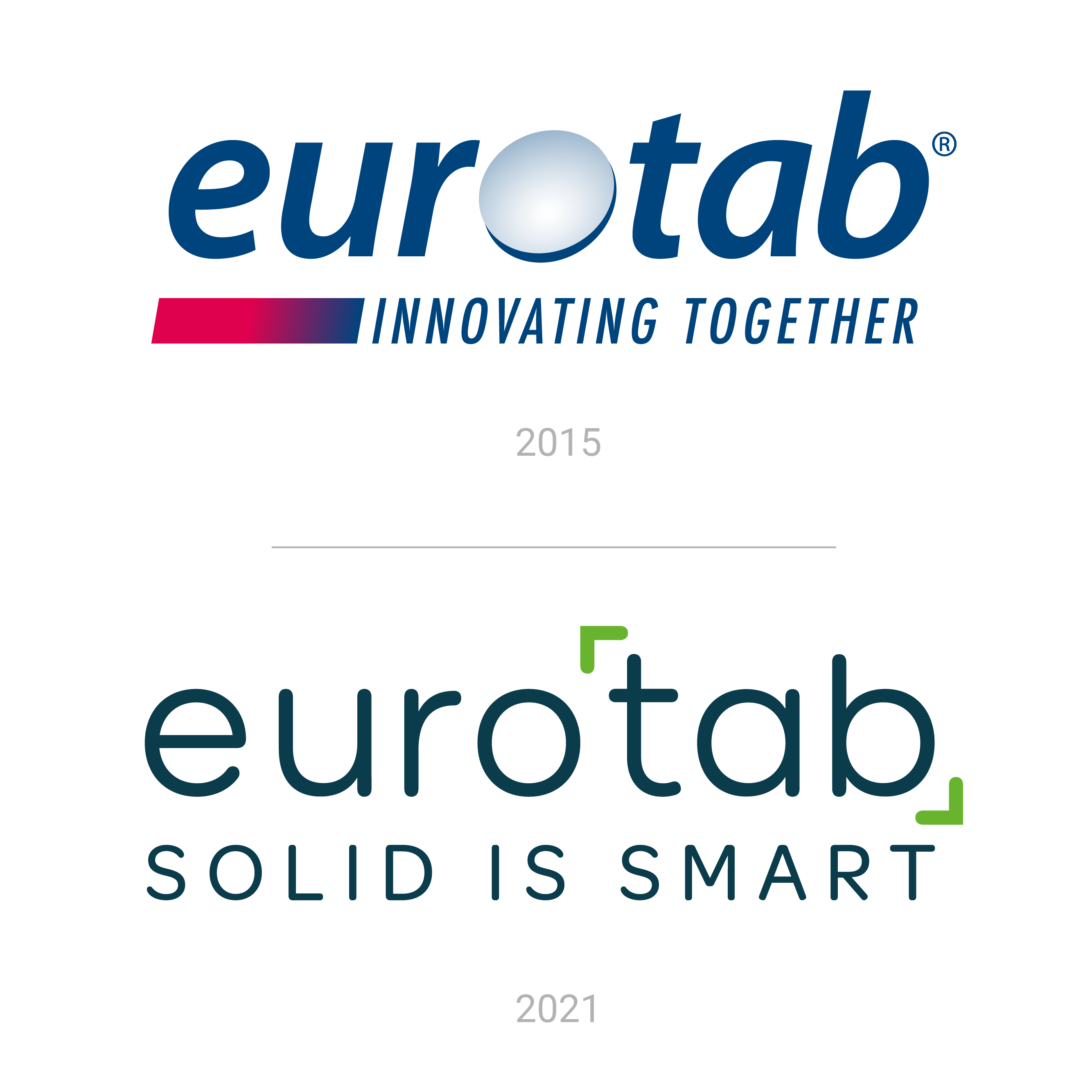
With our new simple and effective "Solid is Smart", we sought to highlight both our business and the strength of the solid form.
We wanted to put our business first, because solids have always been part of our DNA. Our expertise in intelligently transforming liquid cleaning products into solid form dates back to 1957.
Followed by the power and the ingenuity of solids:
• A tablet is environmentally friendly by nature.
It avoids the use of single-use plastic packaging and the transport of household products that are mainly composed of water.
• The single-dose tablet is just the right dose: no waste, no over-consumption.
• The solid solution is all the more intelligent in that it does not compromise on efficiency or hygiene - the tablet remains as effective as a liquid solution!

new image
MEDIA MAKEOVER
Our website has also been redesigned to provide clear and visual information on who we are, our commitments, our products and our news. In addition to this makeover, we have also redesigned our other external digital tools, such as our LinkedIn page and our Youtube account.
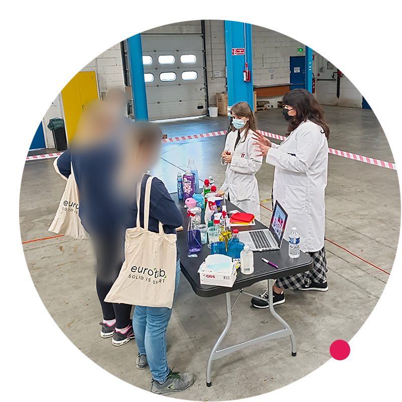
All our in-house tools are being updated: HR, IT, safety, signage, work clothes, etc. The implementation will be completed over a period of several weeks and should result in full visual consistency, both internally and externally.
We do hope that our customers and prospects, current and future employees and current and future partners, will be just as convinced as we are of this new image and feel as much a part of this exciting new chapter.
Eurotab, Solid is Smart !